Complexity has to live somewhere
When someone asks you to make a complex product simple, the real question is who should carry the complexity.

Every complex product eventually gets the same request: make it simpler.
It’s a fair request, but some complexity can’t be removed. Larry Tesler described this as the law of conservation of complexity: every system has a certain amount of complexity that can’t be designed away. Somebody has to deal with it, either the system or the person using it.
That changes the question. Instead of “how do we make this simpler?”, ask “where should this complexity live?” A useful way to look at it is three places it can go.
The examples below are simplified redraws of real products, not screenshots. Wording on screen is paraphrased.
1. To the person using the product
More fields, more options, more decisions on every screen. This is where complexity ends up when nobody decides otherwise.
Sometimes it belongs there. But every decision you leave to the user costs time on every use, multiplied by everyone who uses the product. A choice that takes five seconds is cheap once and expensive ten thousand times. Tesler’s own version: an engineer should spend an extra week to save millions of people an extra minute.
2. To the system
Defaults, suggestions and automation. If the product can make a decision correctly, it should make it.
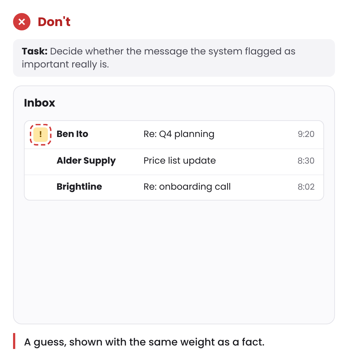
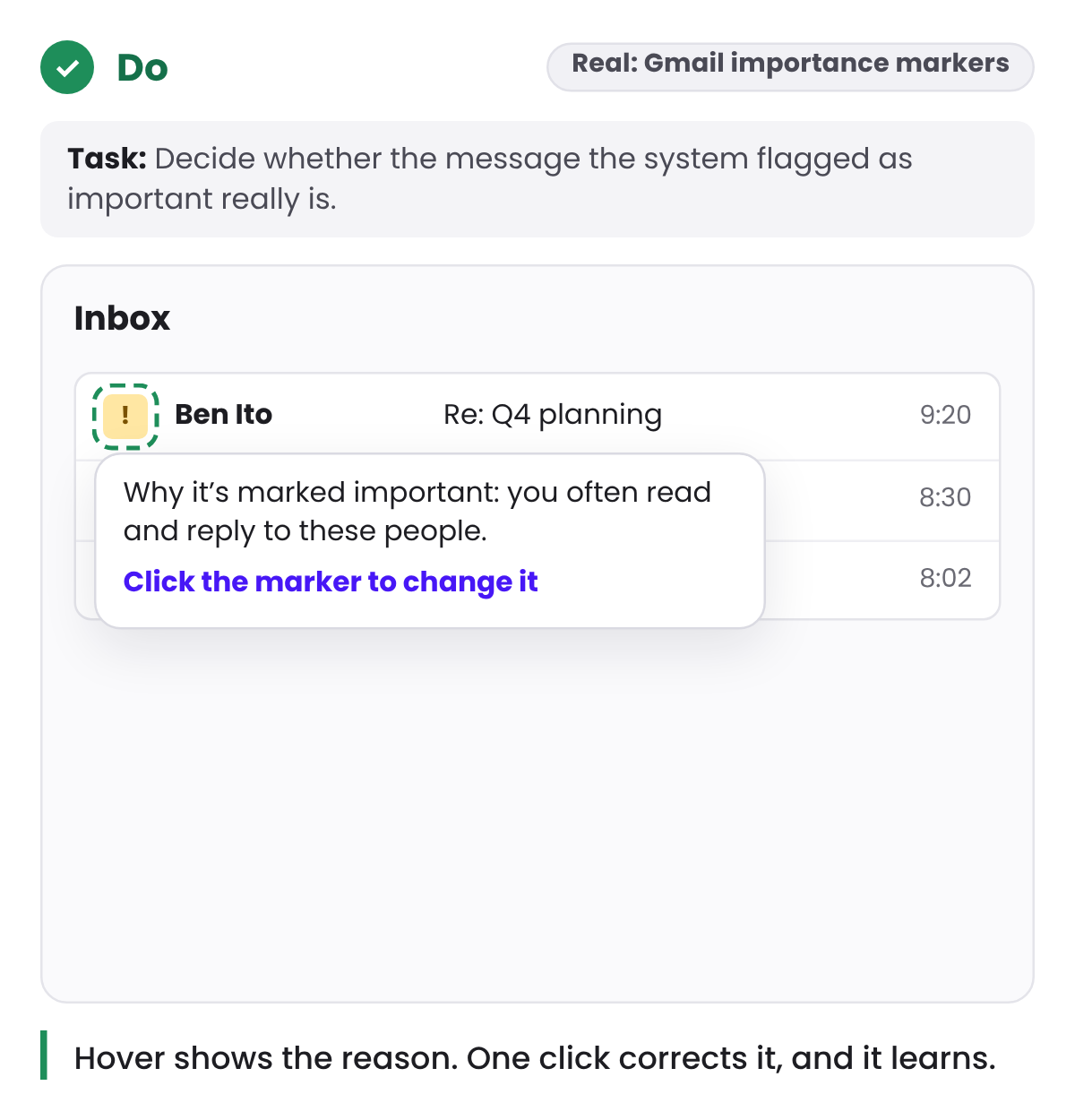
Two conditions come with that. The system has to be right most of the time. And when it decides, it has to show what it decided and let people change it. A default nobody can see is a decision made behind the user’s back, and the first time it’s wrong, people stop trusting the rest.
Gmail’s importance markers do both. The system decides which messages look important, hovering over a marker shows why, and one click corrects it. Gmail learns from the correction.
3. To setup
Some decisions only need to be made once, by one person, for many people. An admin who sets up a team’s categories, templates or permissions on Monday saves everyone else that decision for months.
This matters a lot in business software, because the person who configures the product and the person who uses it every day are usually different people. The admin has time and context. The daily user, in the middle of their work, has neither.
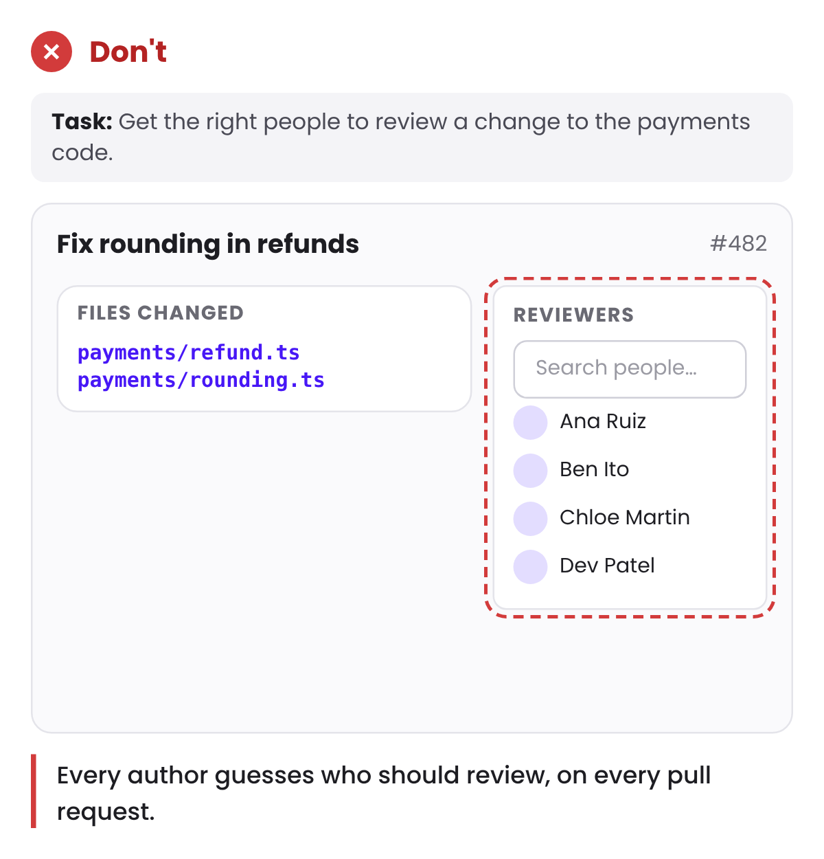
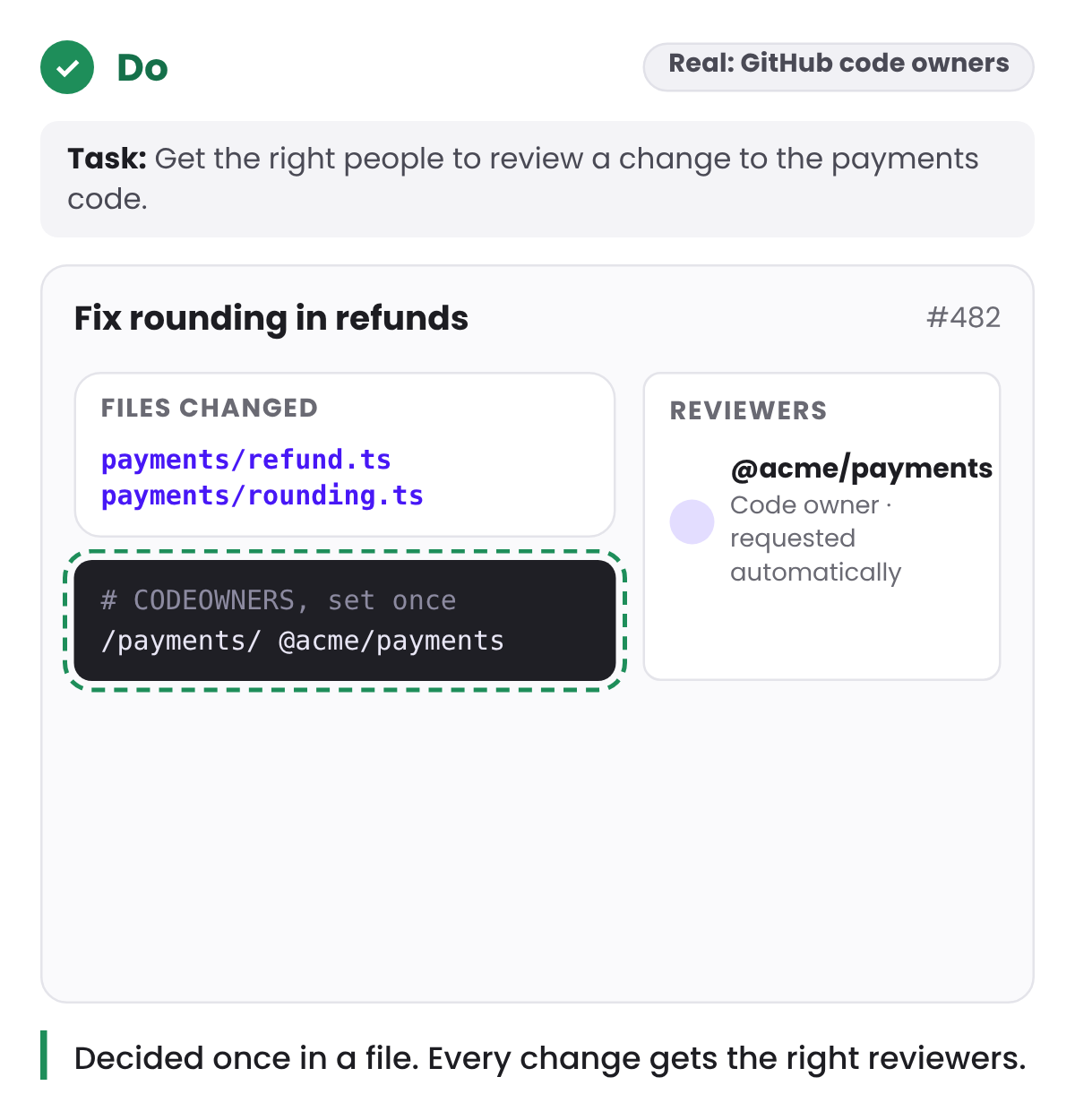
GitHub’s code owners work this way. A team writes down once which people own which folders. From then on, every pull request that touches those files asks the right reviewers automatically. Nobody has to remember who to ask.
It only works if setup is worth doing. Design the settings screens for the moment they make possible, not as a separate feature. If setup is hard, admins skip it, and the complexity falls back on everyone else.
What should stay with the user
Some complexity is the job itself. Approving a payment, choosing which case to handle first, deciding what to tell an upset customer: these depend on judgement the product doesn’t have.
Here the product’s role is to support the decision. Give people the information they need, in the order they need it, and get out of the way. Hiding judgement behind automation doesn’t remove the complexity. It removes the person best placed to handle it.
Fewer choices isn’t always simpler
Hick’s law says the time it takes to choose grows with the number and complexity of options. It’s often quoted as “fewer options is better”.
For experts, that’s only half true. They usually know what they’re looking for. Cut an option they need, and their work doesn’t get simpler. It moves into a workaround: a spreadsheet, a sticky note, a message to a colleague. The complexity is still there, only now it sits outside the product, where nobody can see it or improve it.
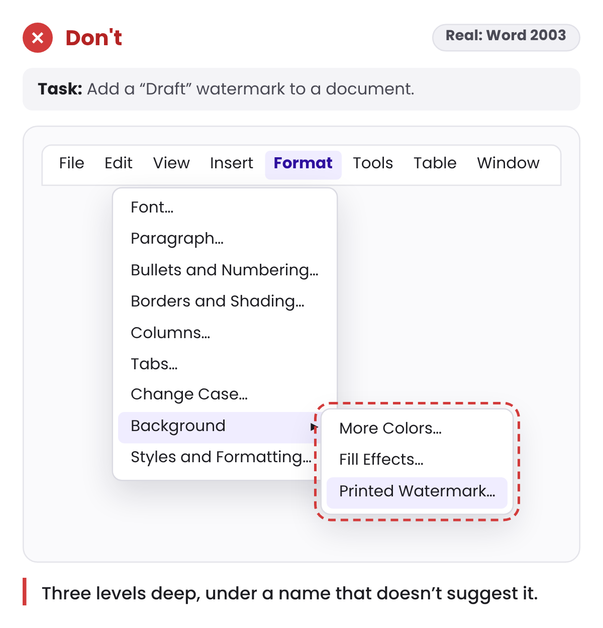
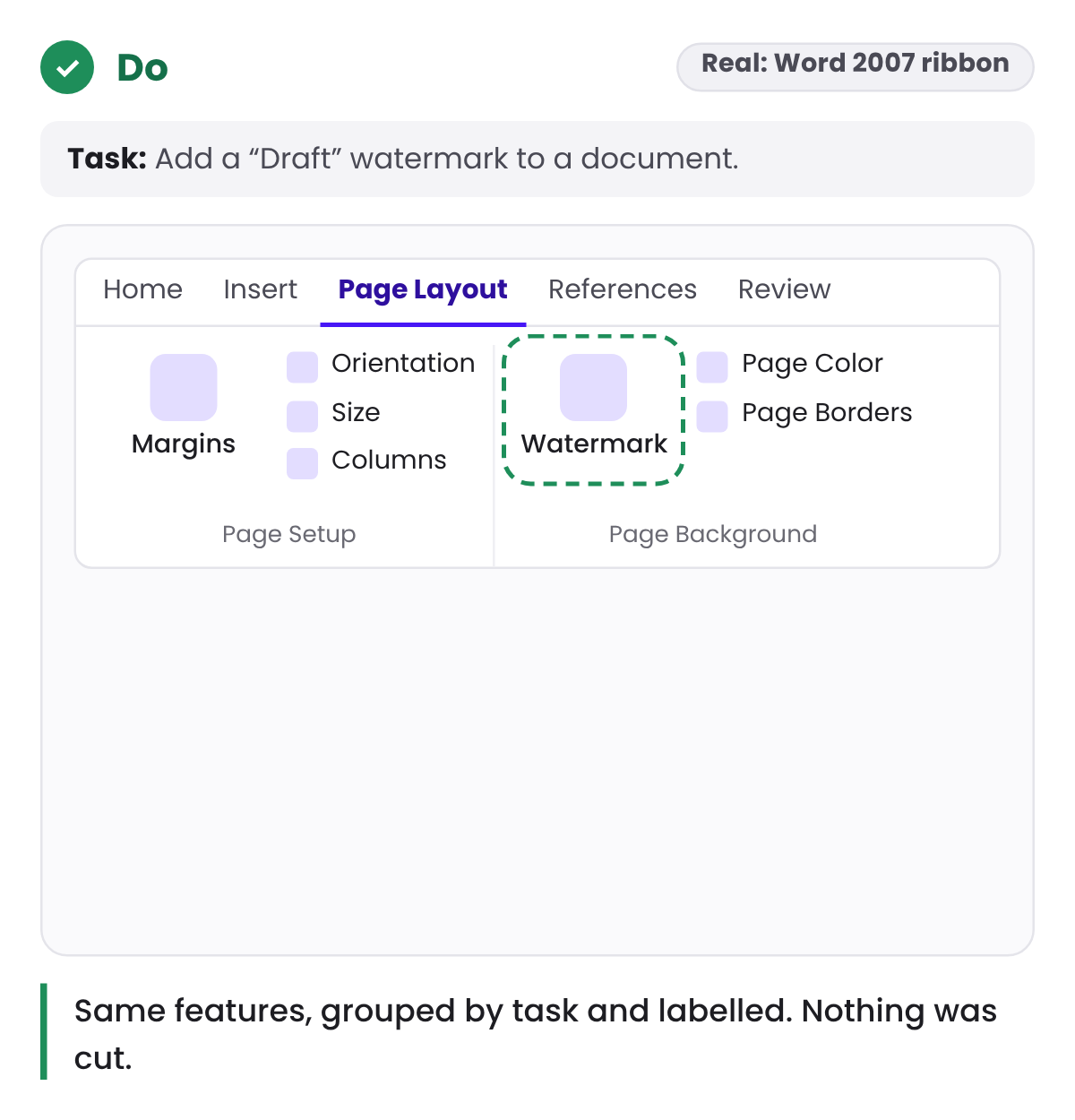
Hiding options deep in menus has a similar effect. Before Office 2007, Microsoft’s Office team described people asking for features Office already had, because they couldn’t find them. The ribbon that followed didn’t remove features. It grouped them by task under labelled tabs and made the most-used commands larger.
For experts the fix is usually order, not removal. Group options the way they think about them, put the frequent ones first, and keep the rare ones easy to find.
One question before you remove anything
When a feature, field or option is up for removal, ask where its complexity will go.
- Into the system? Make sure it can get the decision right, and show what it did.
- Into setup? Make setup quick and clearly worth it.
- Into a workaround? Then nothing got simpler. It just left the screen.
A simple product still has complexity. Each piece of it just sits with the person, or the part of the system, best able to handle it.