Five usability rules, applied to software people use all day
The classic usability heuristics still hold. For daily, expert use, a few of them point somewhere else.

Most usability advice is written for a first visit. Someone opens a page they have never seen and needs to finish one task. Jakob Nielsen’s ten usability heuristics, in their current form since 1994, are still one of the best short lists for that situation.
A lot of software isn’t used like that. A dispatcher, an accountant at month-end or a support agent can open the same screens hundreds of times a week. They know their work better than the people who built the tool. The rules still apply to them, but a few of them mean something different.
Here are five of the heuristics, and how they read for software people use all day.
The examples below are simplified redraws of real products, not screenshots. Wording on screen is paraphrased.
1. Recognition over recall: keep the path visible, then make it fast
The rule: don’t make people remember what the interface could show them. Menus, labels and visible options beat commands people have to memorise.
For a daily user, memory is a feature. Experts type status codes, use shortcuts and keep saved filters. After the twentieth time, nobody wants to scroll a list for something they know by heart.
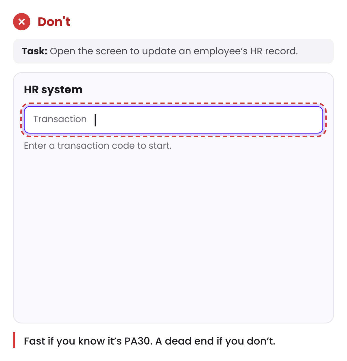
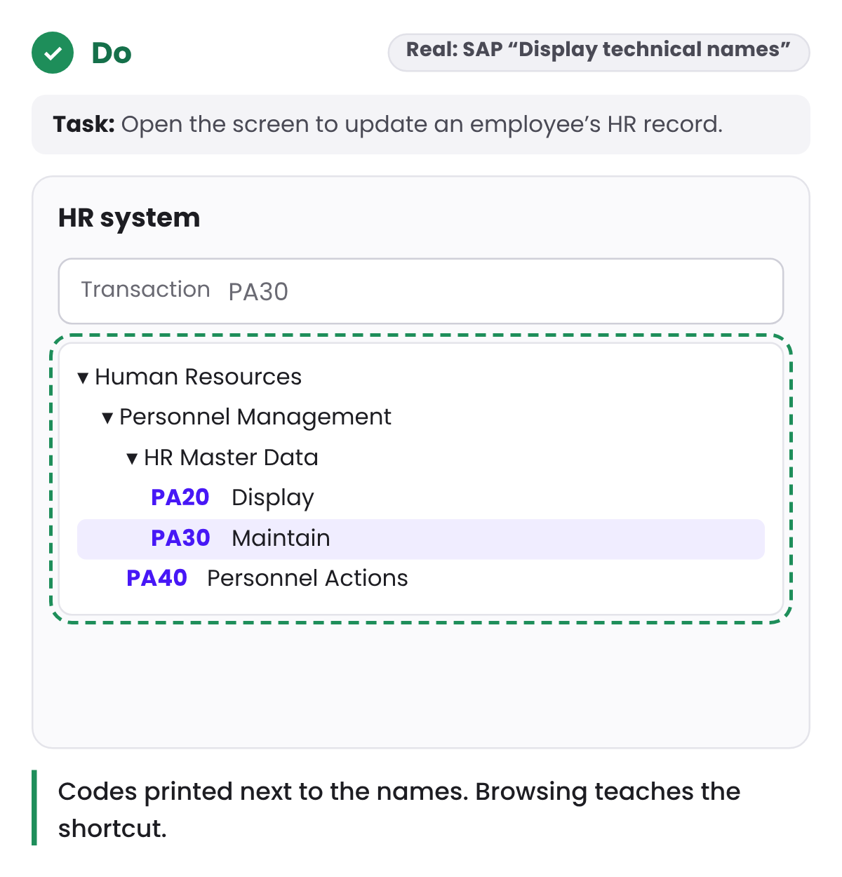
The answer is to support both. SAP is a good example. Experienced users jump straight to a screen by typing its transaction code, like PA30 for maintaining an employee’s HR record. Newer users browse a menu of names. A setting called Display technical names prints the code next to each name in that menu, so browsing is also how people learn the codes.
A field that only accepts the code turns a tool into a memory test.
2. Minimalist design: remove what doesn’t help the decision
The rule: every extra piece of information competes with the information that matters.
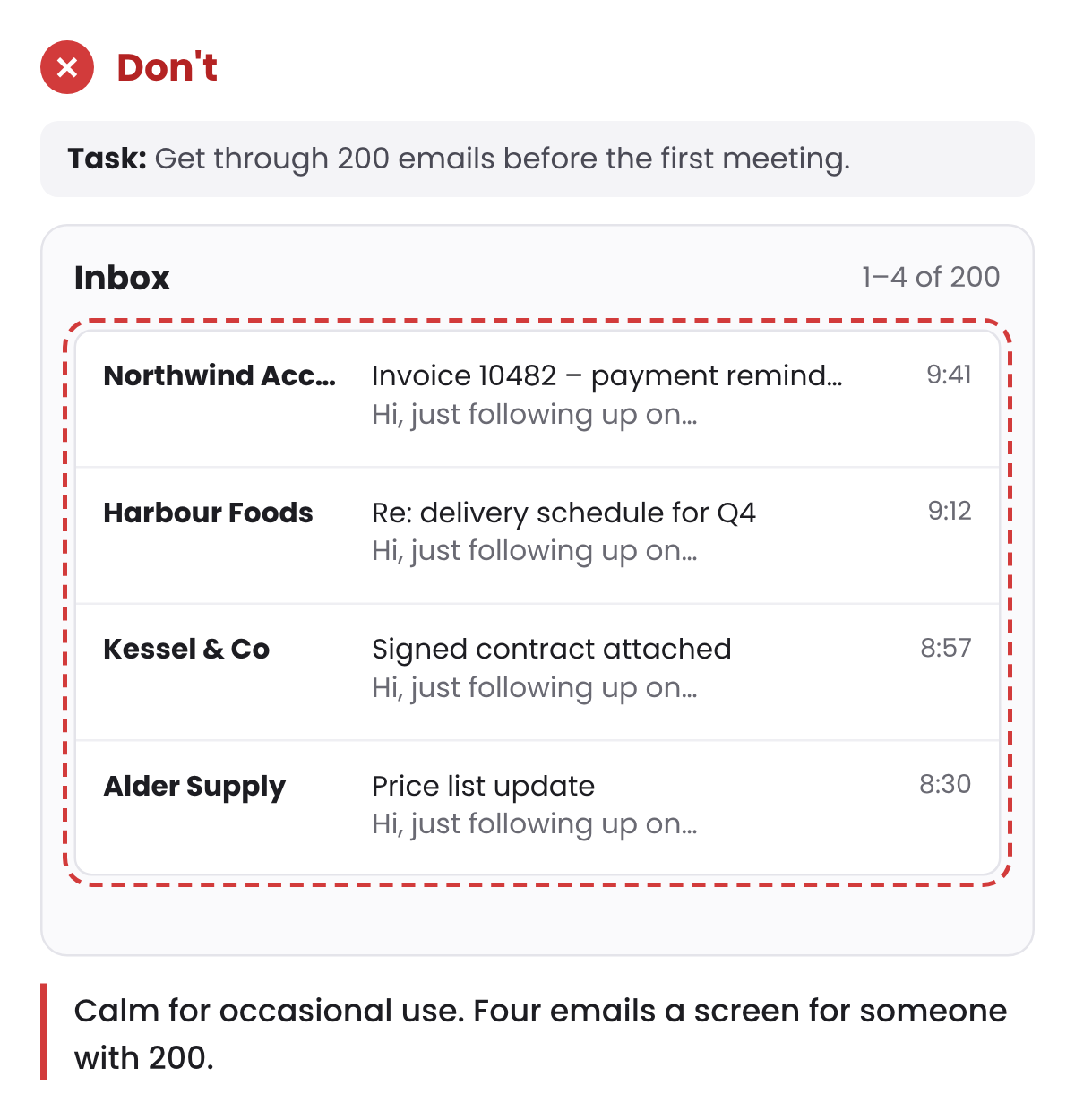
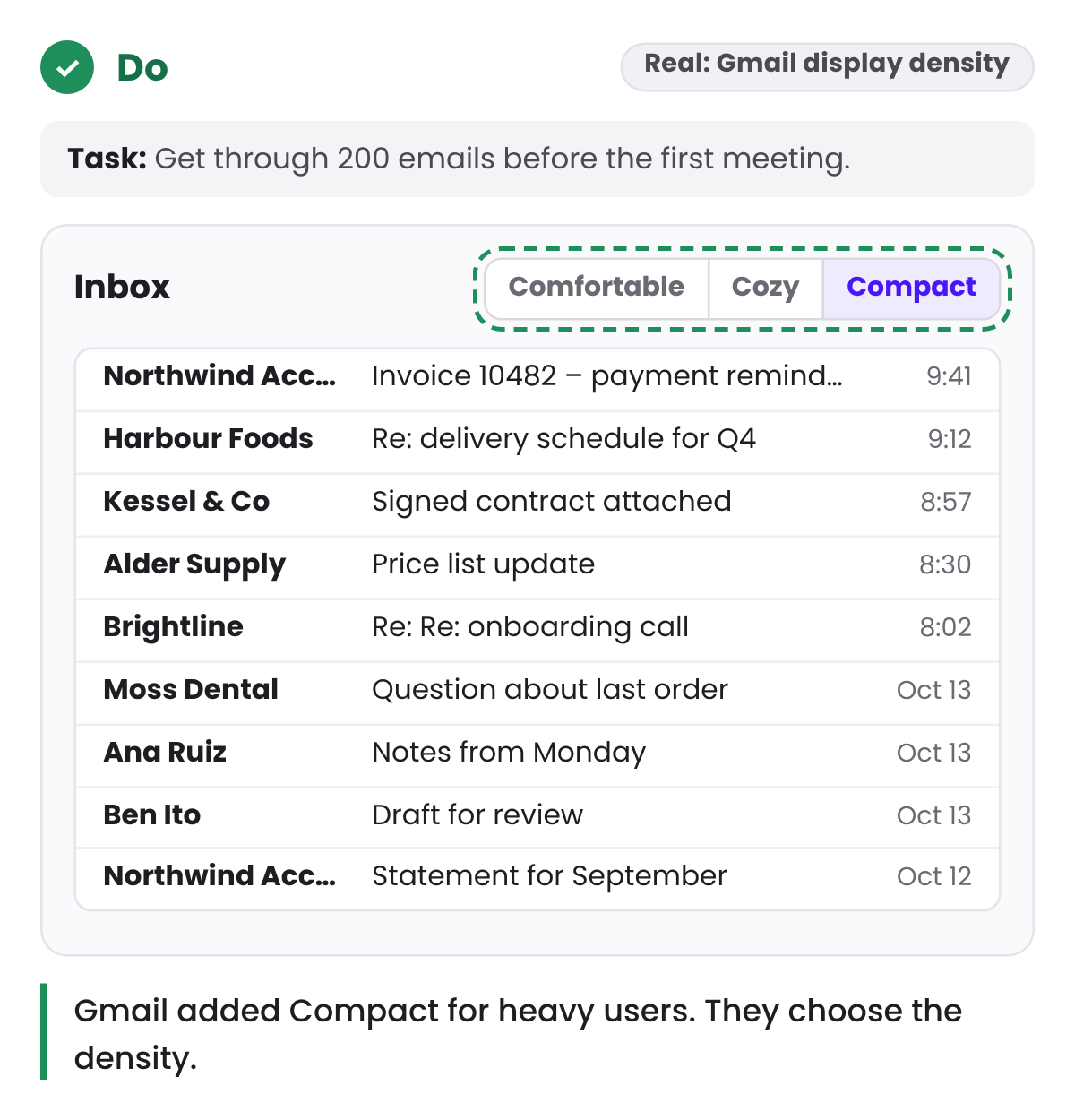
People often read this as “show less”. In expert tools that goes wrong quickly. Someone who works through two hundred items before lunch needs to see many of them at once.
Gmail learned this in 2011. Its redesign added white space by default, which many people preferred. People who lived in their inbox wanted the old tight layout back, to see more email without scrolling. Gmail kept the calmer default and added a density setting with a Compact option.
A better test is about the decision, not the amount. What does this person need to decide on this screen, and does each element help with that? A dense table can pass that test. A spacious screen with decorative cards and one useful number can fail it.
Density works when it’s organised: aligned columns, one type scale, and the important values clearly heavier than the rest.
3. Match the real world: use their words
The rule: speak the user’s language, with words and ideas they already know, rather than system terms.
For experts, their language is jargon. A finance team says “accrual” and “period close”. A field team talks about jobs, not tickets. Swapping those terms for friendlier, generic words doesn’t make the product simpler. It makes people translate, and every translation is a chance to get something wrong.
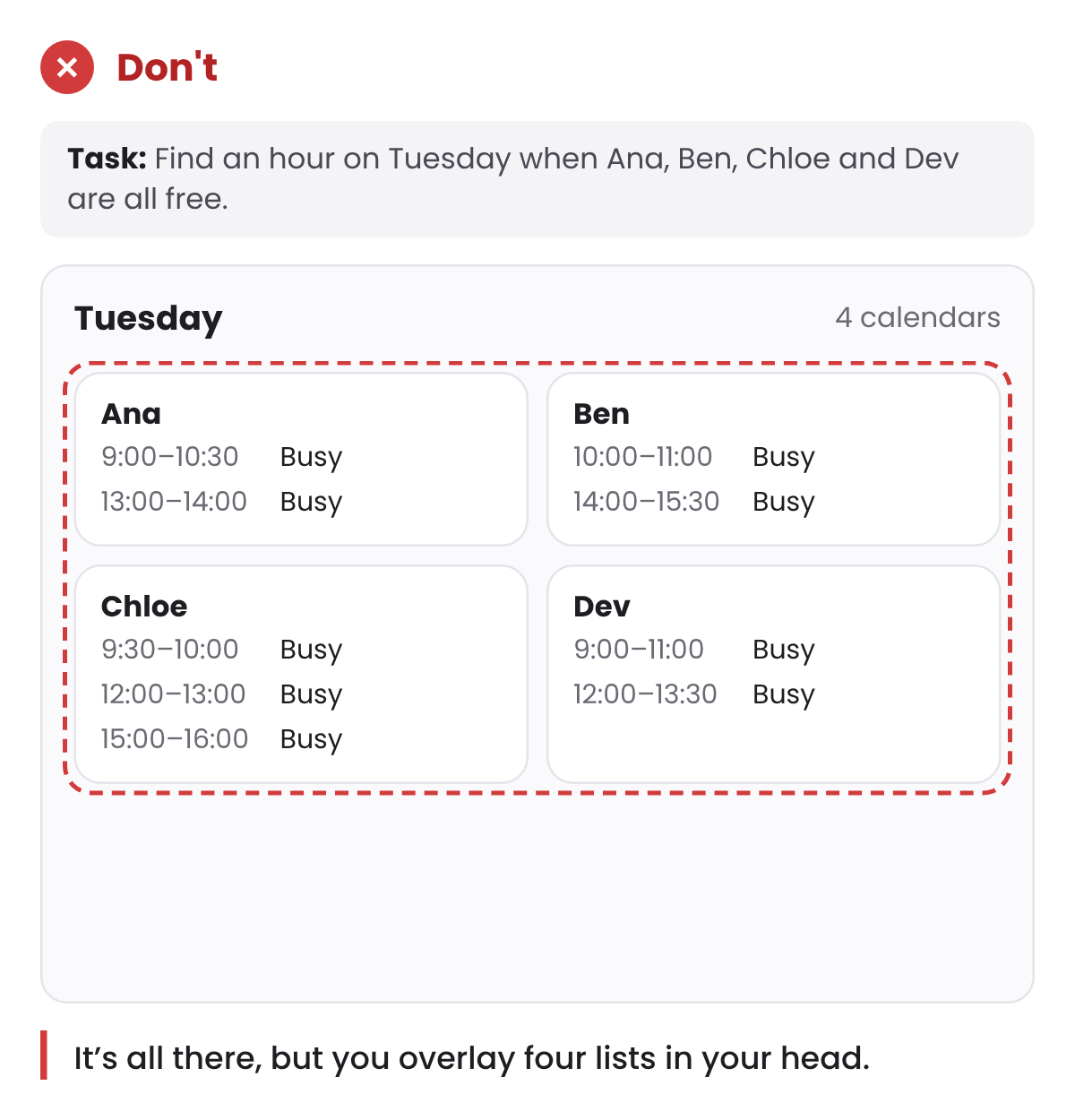
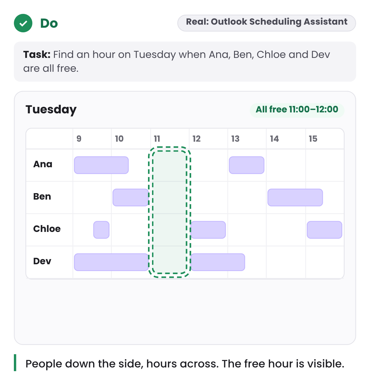
The same goes for structure. When people book a meeting, they think in people and hours. Four separate calendars hold all the information, but the question “when are we all free?” still has to be answered in your head. Outlook’s Scheduling Assistant lays it out the way people think about it: one row per person, time across the top, so the free hour is visible.
4. Visibility of system status: show what happened without them
The rule: keep people informed about what’s going on, with feedback in reasonable time.
In a simple app, status is a spinner or a “Saved” message. In products with automation, the status that matters is different: what did the system do on its own, and what is it waiting for from me?
When rules route work, merge records or send messages automatically, people need to see that it happened, why, and how to change it. Without that, people often stop trusting the automation and check everything by hand. That’s more work than having no automation at all.
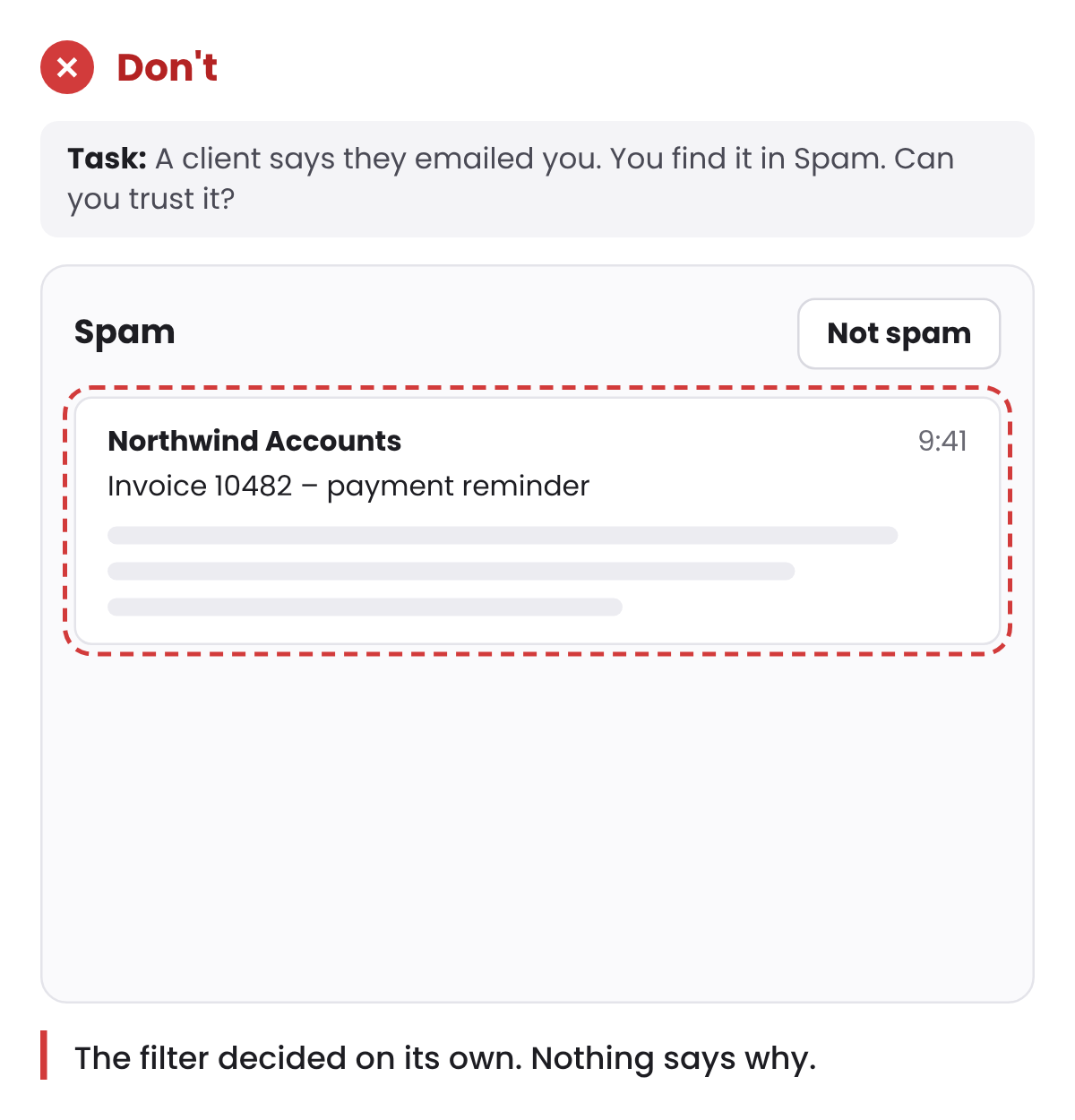
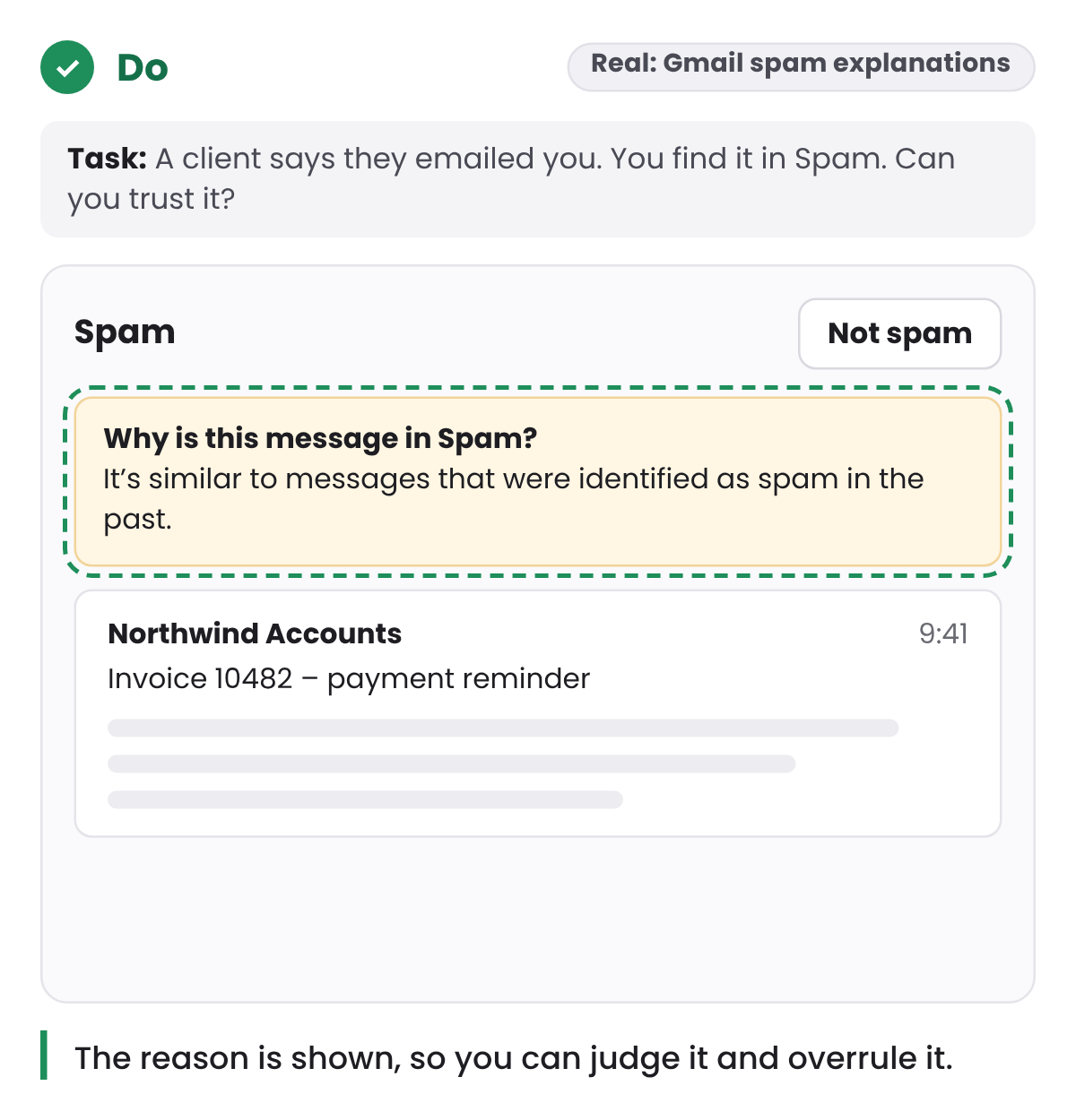
Gmail’s spam filter is a good model. Since 2012, a message in the Spam folder explains why it’s there, for example that it looks like messages identified as spam before. A short reason is enough for people to judge the decision and overrule it.
Silence needs a status too. If the system isn’t receiving data, say so. People read an empty screen as “nothing happened”, even when the truth is “we can’t tell”.
5. Error prevention: Undo beats “Are you sure?”
The rule: prevent problems before they happen, and give people a clear way out.
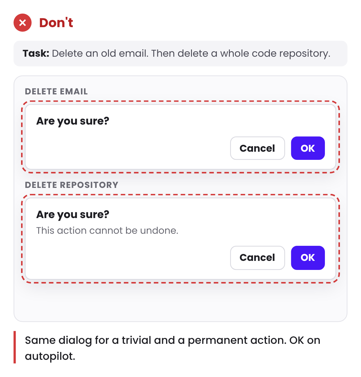
The usual tool is a confirmation dialog. For daily users it stops working fast. When every action asks “Are you sure?”, people learn to click through without reading. GitHub’s Primer design guidelines call this confirmation fatigue, and advise against confirming actions people can easily undo.
A rule of thumb that follows from this:
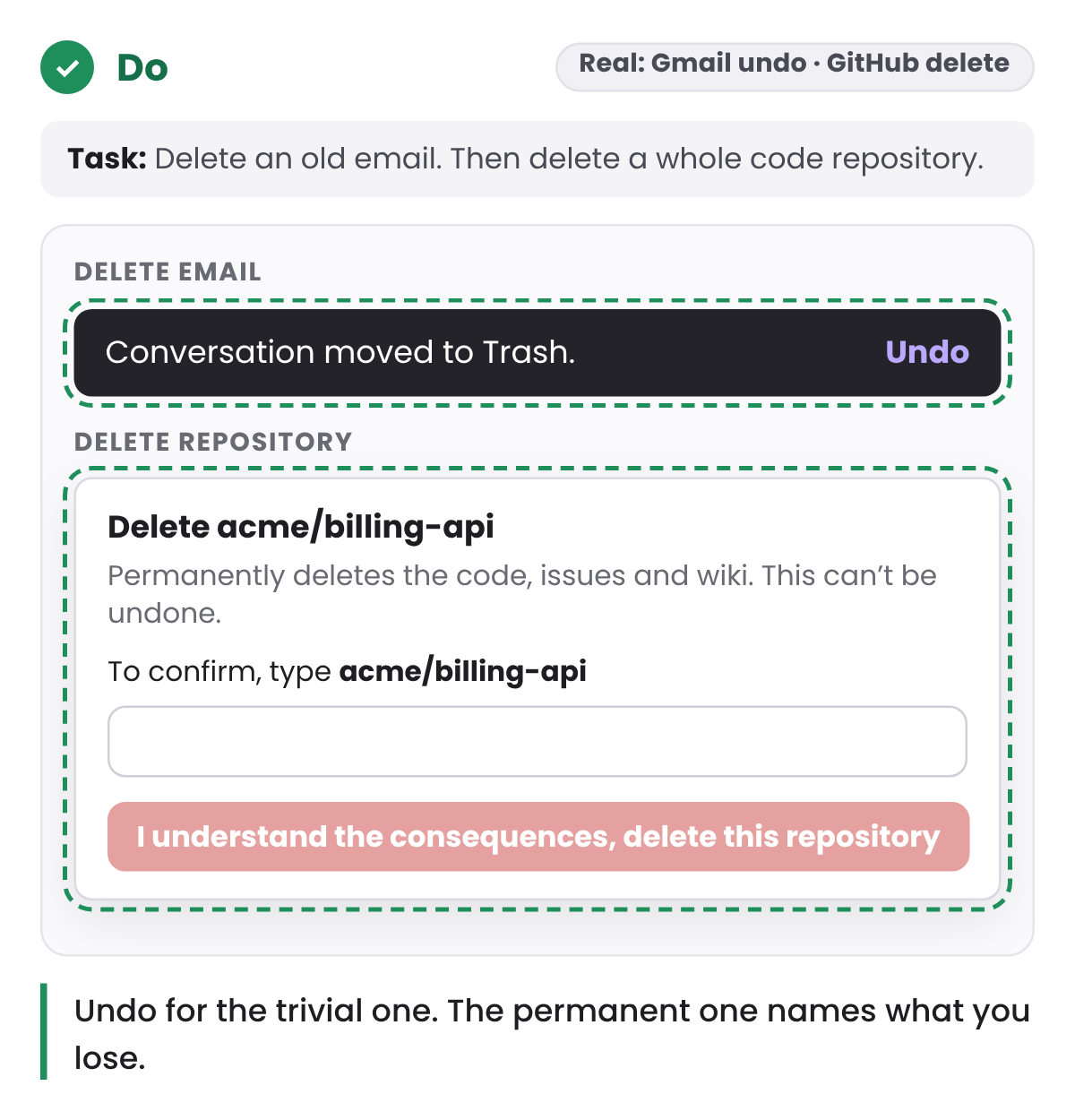
- If an action can be undone, don’t confirm it. Do it, and offer Undo.
- If it can’t be undone, confirm it and name what will happen: “Delete 14 invoices from March?” instead of “Are you sure?”
- Make the button repeat the verb. “Delete invoices” is harder to click on autopilot than “OK”.
Gmail and GitHub show both halves. Deleting an email in Gmail happens straight away, with Undo in a bar at the bottom of the screen. Deleting a repository on GitHub asks you to type the repository’s name before the button, “I understand the consequences, delete this repository”, works.
That keeps friction where it protects someone, and removes it everywhere else.
The heuristics still hold for expert software. What changes is the person they assume. Design for someone on their hundredth visit as carefully as for someone on their first, and give both of them a path.